MyDigicel App
Digicel is a leading telecommunications company operating in 25 countries across the Caribbean, Central America, and Oceania. As Digicel’s flagship app, MyDigicel connects over 10 million users with mobile services, data plans, and payments.
As a UI/UX designer, I collaborated with Digicel’s product and development teams to enhance user experience, improve navigation clarity, and unify design standards across mobile and web platforms. The result was a more cohesive, scalable, and accessible interface that strengthened Digicel’s digital presence.
Team
PM, Designers, Developers
My Role
UX Designer
Deliverables
Website, Mobile
Time Frame
2020-2022
Problems
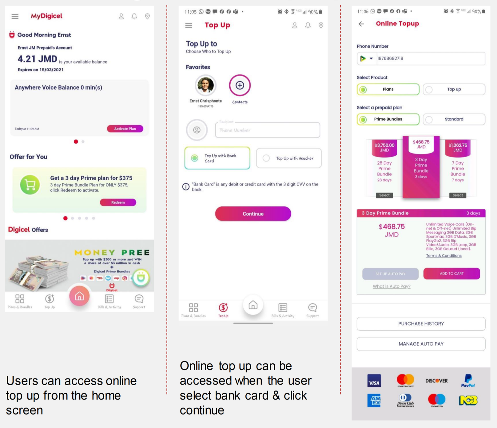
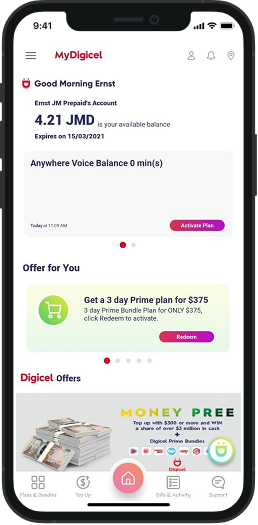
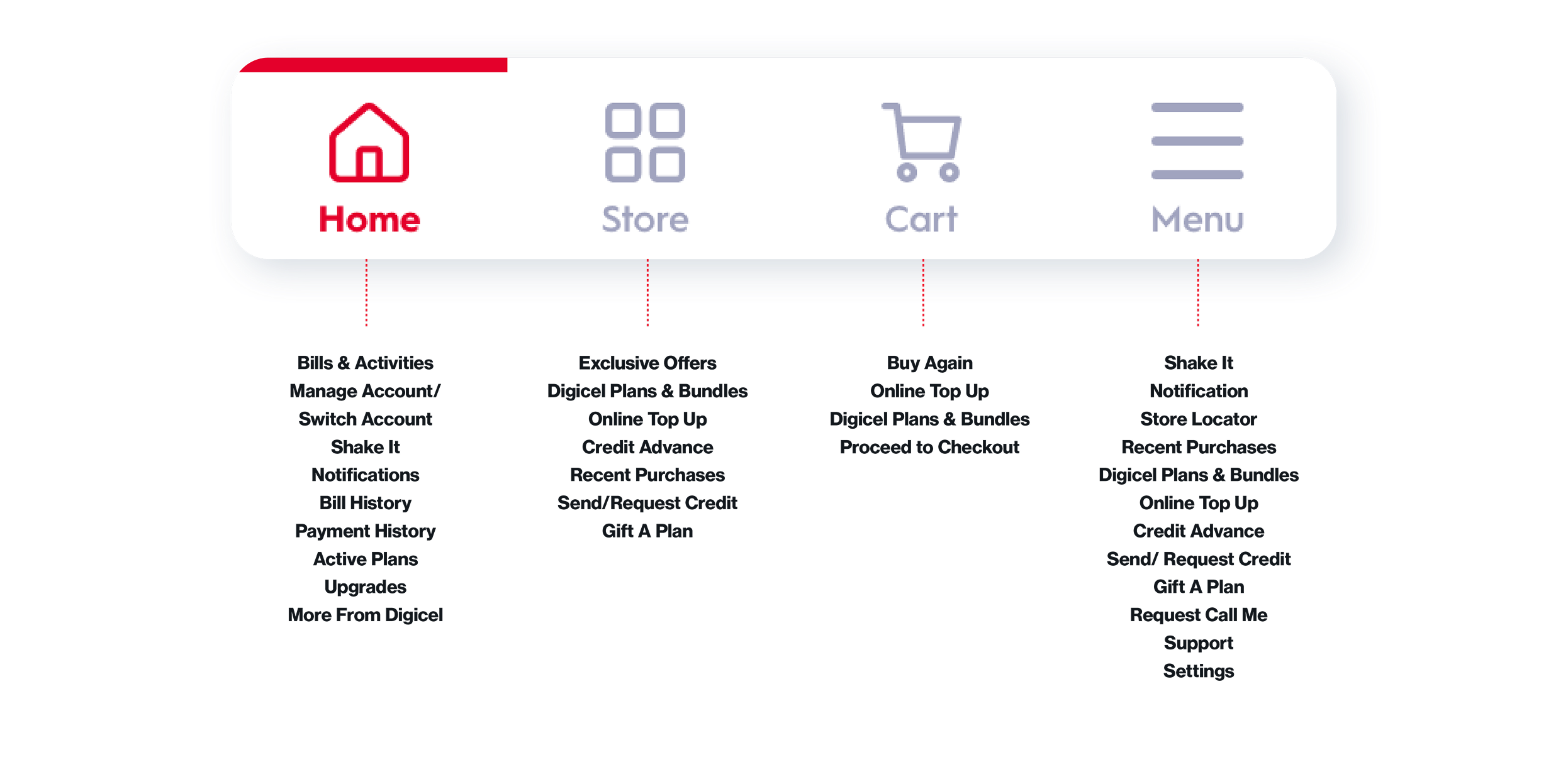
Digicel’s users relied on multiple apps to manage everyday tasks such as data plans, payments, and subscriptions.
Core actions like top-up, plan renewal, and payment were buried within side navigation menus.
Dense information and weak hierarchy made it difficult for users to locate key content at a glance.
Repetitive steps and disconnected pages slowed down task completion and increased user frustration.
The lack of visual consistency weakened the overall brand perception across platforms.
Goal
The goal was to make complex telecom information simple, clear, and easy to navigate.
I aimed to bring structure to dense content and improve accessibility by highlighting key actions such as top-up and plan management. The focus was on simplifying user flows, establishing visual hierarchy, and creating a consistent experience that helps users complete essential tasks with confidence and ease.
Design System & Visual Consistency
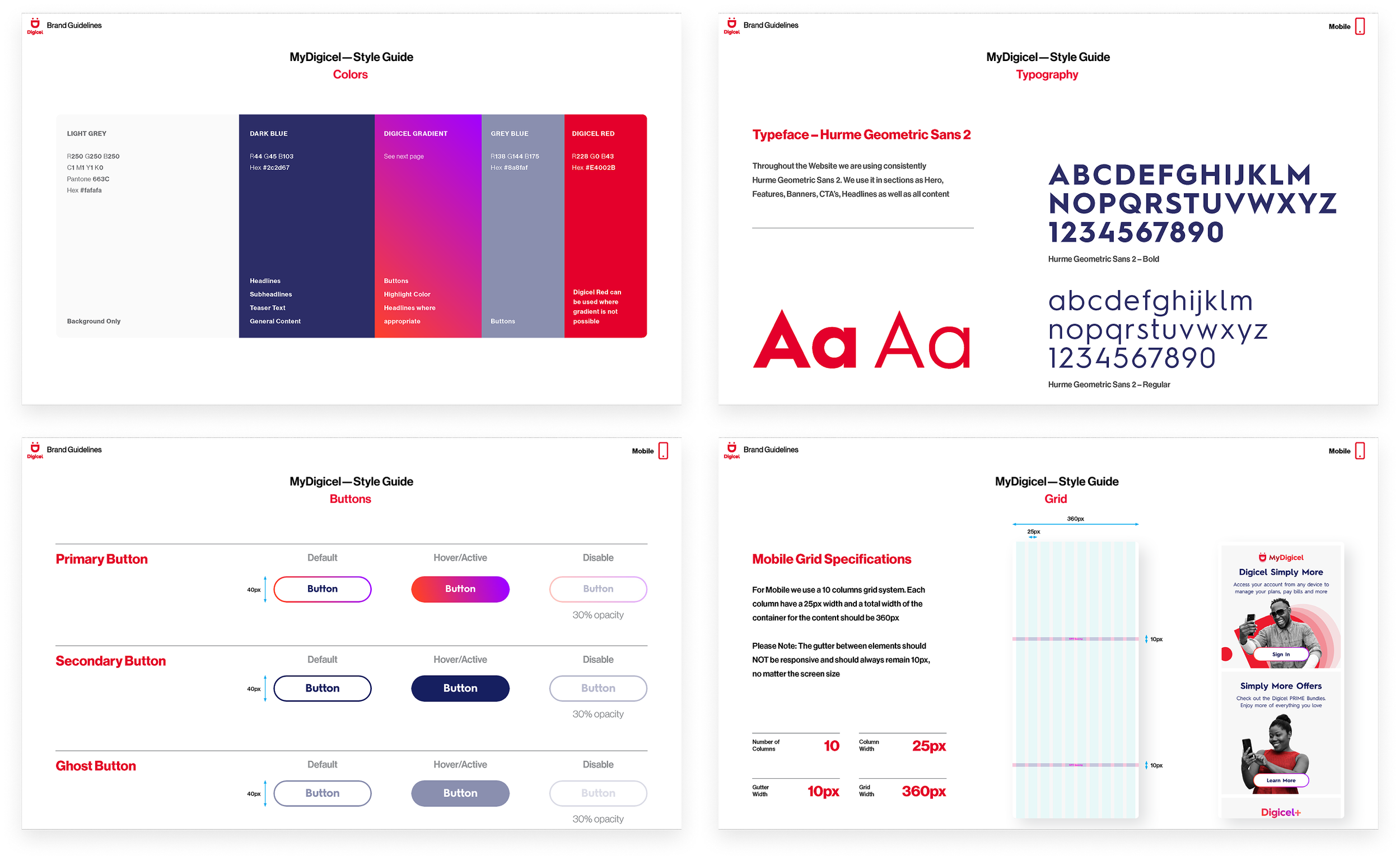
Working closely with the design team, we refined the visual guidelines that defined color, typography, and component usage across the app. This framework improved consistency and simplified how users engaged with primary actions.
Process
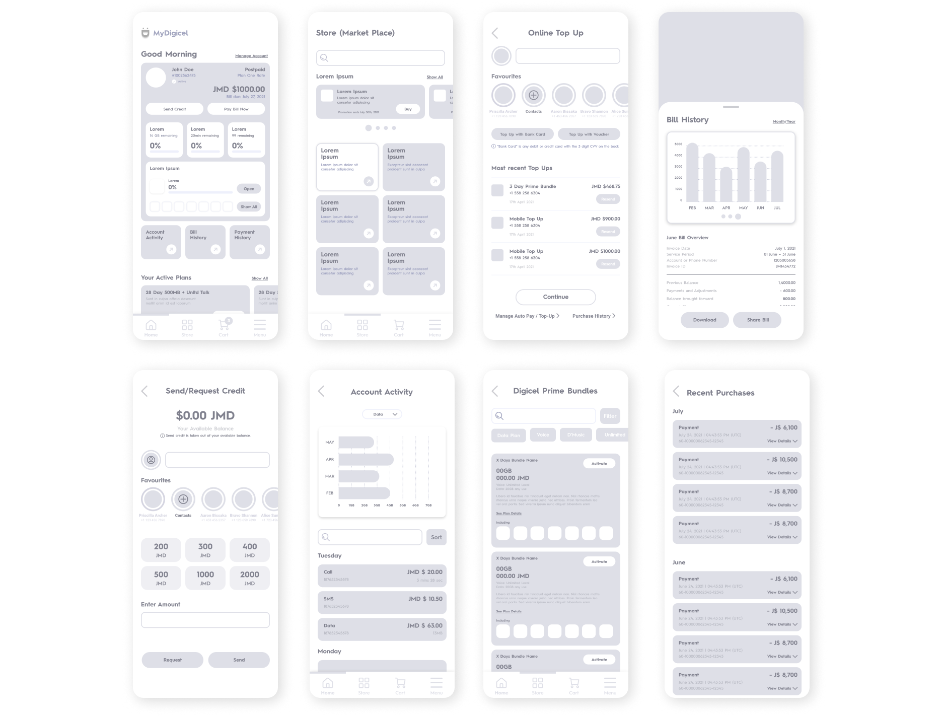
To achieve this goal, I started by analyzing user flows and identifying friction points in the existing app. Through multiple iterations, wireframes, and usability reviews, I focused on simplifying navigation, reorganizing information, and improving task efficiency.
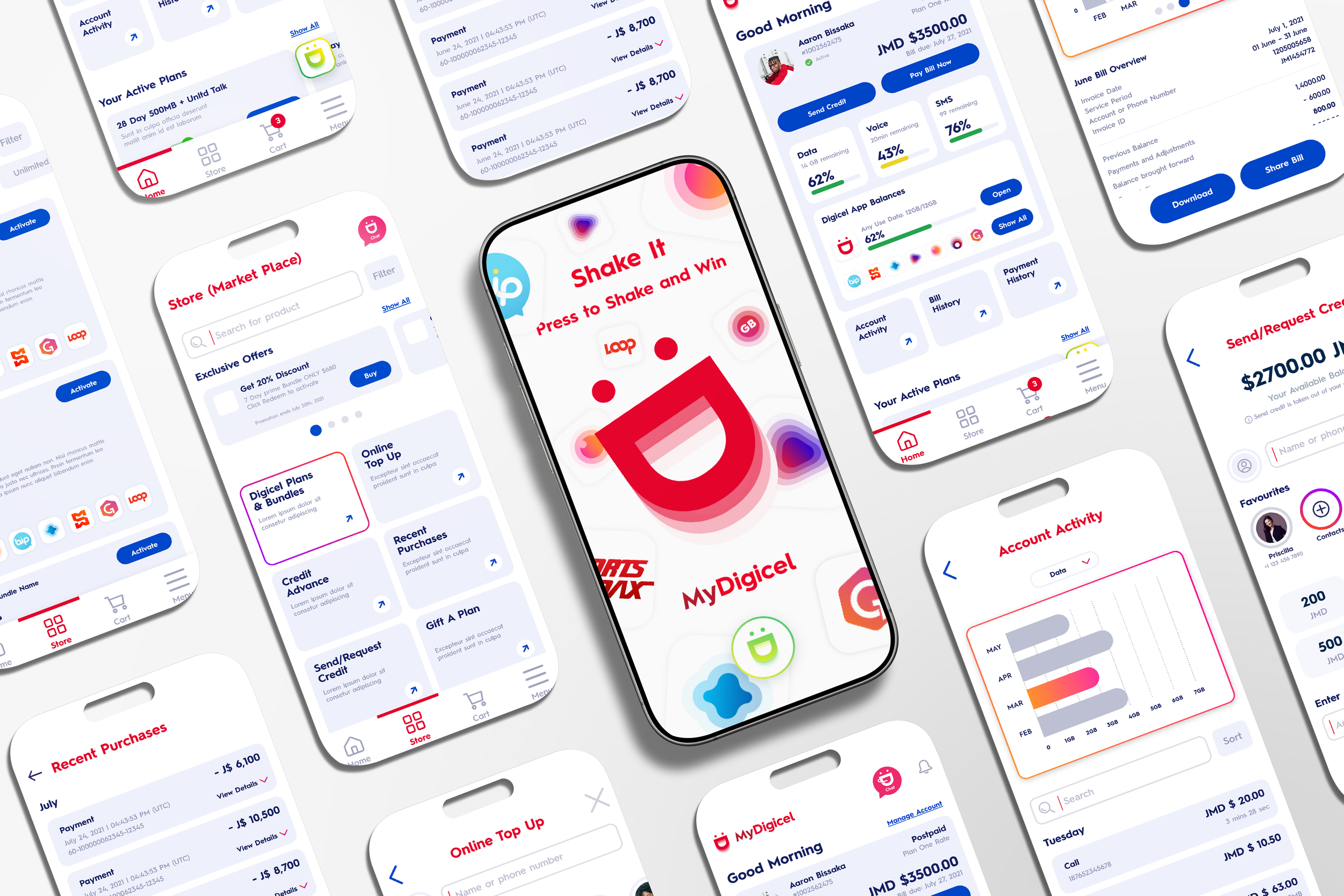
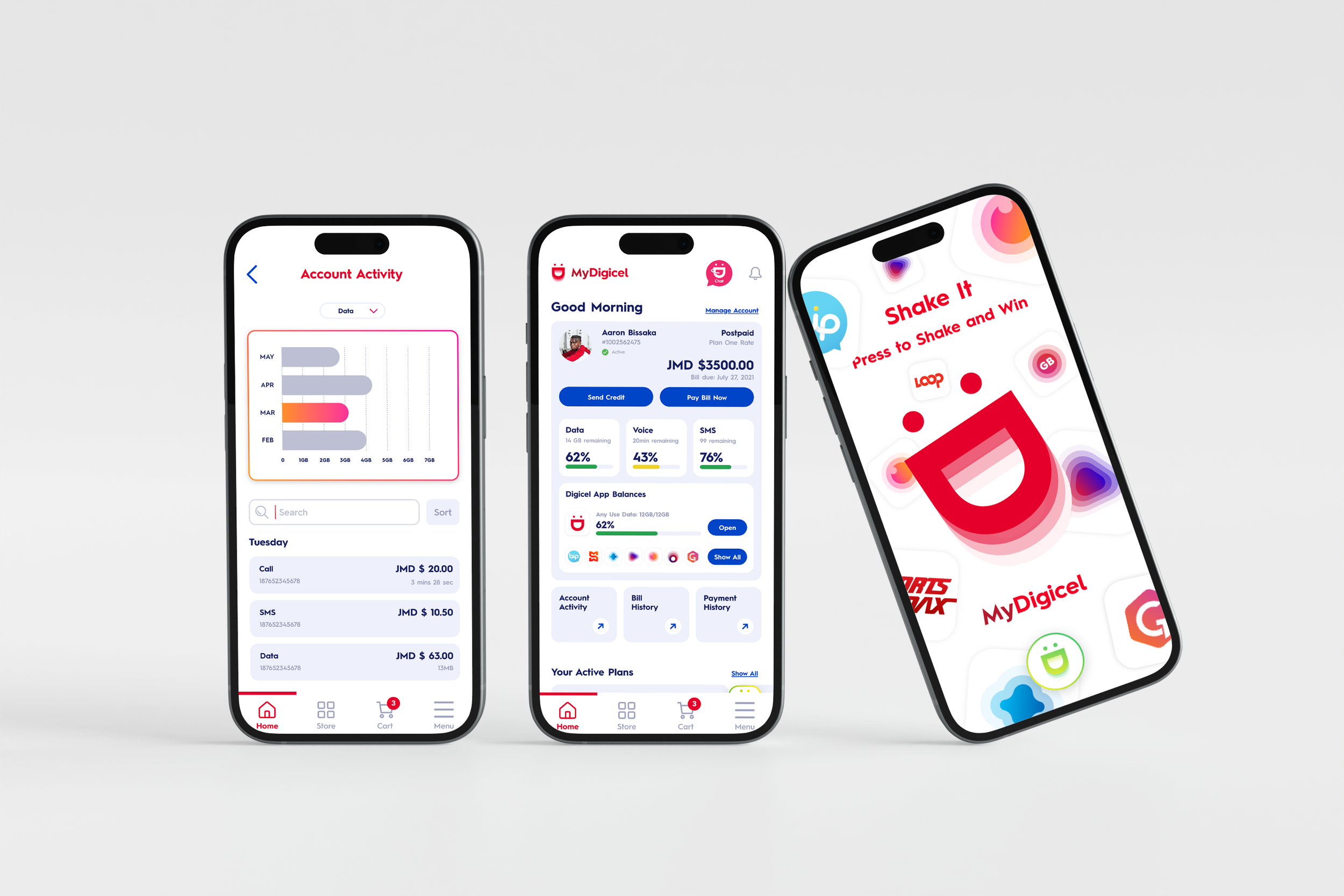
High-fidelity Wireframes
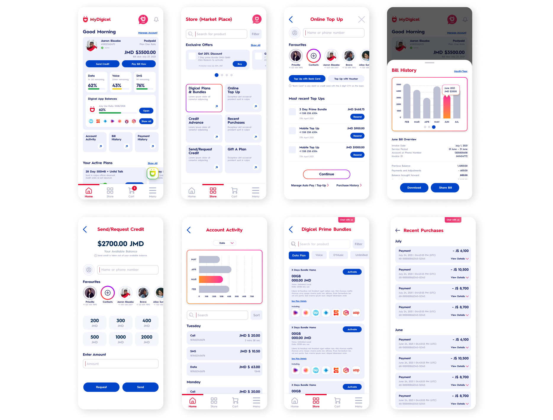
Key actions such as top-up, plan management, payments, and account activity were emphasized through clear hierarchy, consistent spacing, and reusable components.
Card-based layouts, standardized buttons, and aligned typography allowed users to scan content easily and complete tasks with minimal friction.
Result
The redesigned MyDigicel experience was successfully launched and used by millions of users across the Caribbean.
The updated navigation and modular layout made it easier for users to understand account information, manage plans, and complete top-up and payment tasks with greater confidence. By simplifying dense telecom data and surfacing high-frequency actions, the new experience reduced friction across core user flows such as Home, Online Top-Up, Billing, and Purchase History. The consistent visual system also enabled faster iteration and smoother collaboration across design and development teams. Today, MyDigicel supports 10M+ downloads, serving as a primary digital touchpoint for Digicel customers. The redesign helped establish a scalable foundation that continues to support new features and regional updates across the platform.