
OJC Fund Website
The OJC Fund is a philanthropic platform designed to streamline and empower charitable giving for donors, enabling them to make a meaningful impact with simplicity and confidence.
As the UI/UX designer on this project, I led the redesign of its web presence, bringing a modern, minimal aesthetic with intuitive flows that align with donor needs and organizational goals.
Team
PM, Designers, Developers, Copywriters
My Role
UX Designer
Deliverables
Website
Time Frame
2025

Target Audience
The OJC Fund serves individual and family donors managing charitable giving through donor-advised funds, nonprofit organizations using the platform to coordinate contributions, and first-time donors who need clear guidance to understand where to begin. These users value simplicity, trust, transparency, and intuitive navigation, which directly informed decisions around reorganizing the information architecture, clarifying messaging, and creating a guided donor journey.
Problems in the Previous Experience
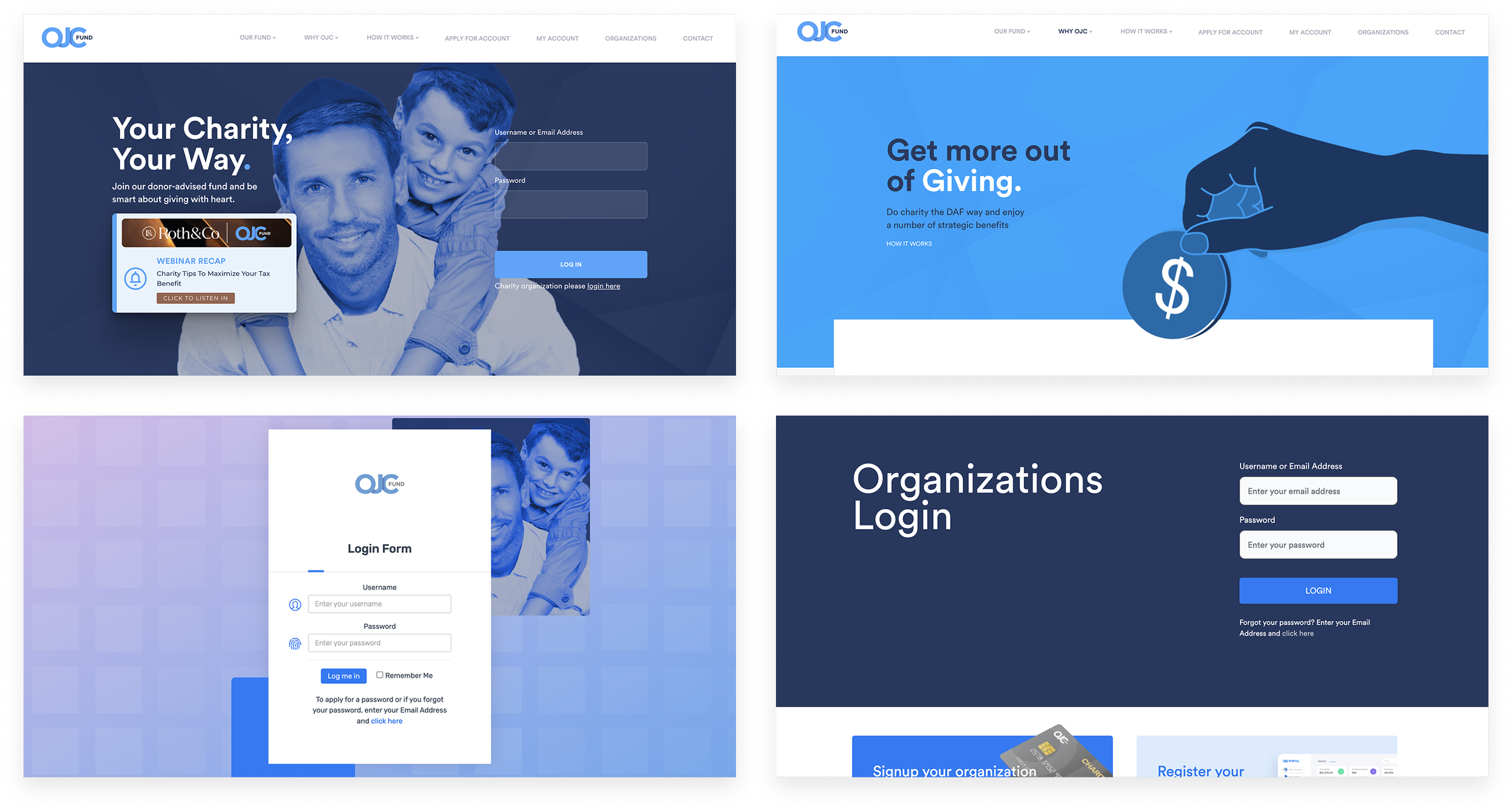
OJC Fund’s previous website made it challenging for donors and organizations to understand the platform’s value, navigate key actions, and build trust in the experience.
Outdated visuals, generic imagery, and limited emotional tone weakened the fund’s credibility and made the platform feel less trustworthy.
The website lacked a clear value explanation, making it difficult for first-time users to understand what OJC Fund is and how donor-advised funds work.
Inconsistent layouts and design patterns across pages (home, login, organization portal) created a fragmented brand experience and reduced user confidence.
Visual hierarchy was weak, and important actions like “Donate,” “Learn More,” and “Login” were buried within dense layouts.
Solution : Quantitative Research
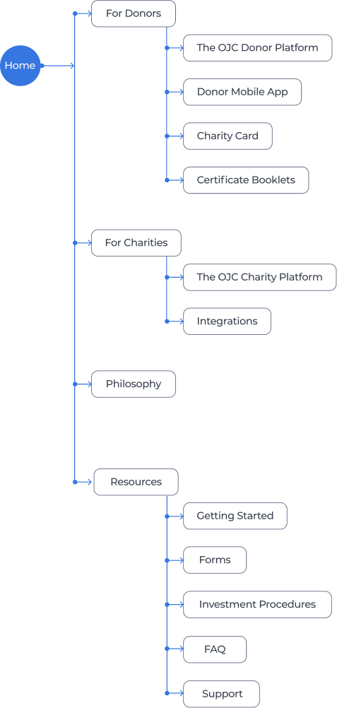
I analyzed the previous website’s navigation using quantitative data such as menu click-through rates, drop-off points, and page engagement time. The data showed that users frequently ignored deep dropdown menus like “How It Works” and “Why OJC,” and many pages inside these categories received extremely low interaction. This indicated that the information hierarchy did not match what users were looking for and created unnecessary cognitive load.
Based on these insights, I reorganized the navigation into clearer, role-based categories such as For Donors, For Charities, Philosophy, and Resources. This simplified structure aligns with actual user behavior, reduces decision fatigue, and helps visitors reach relevant content with fewer steps.
Low-fidelity Wireframes
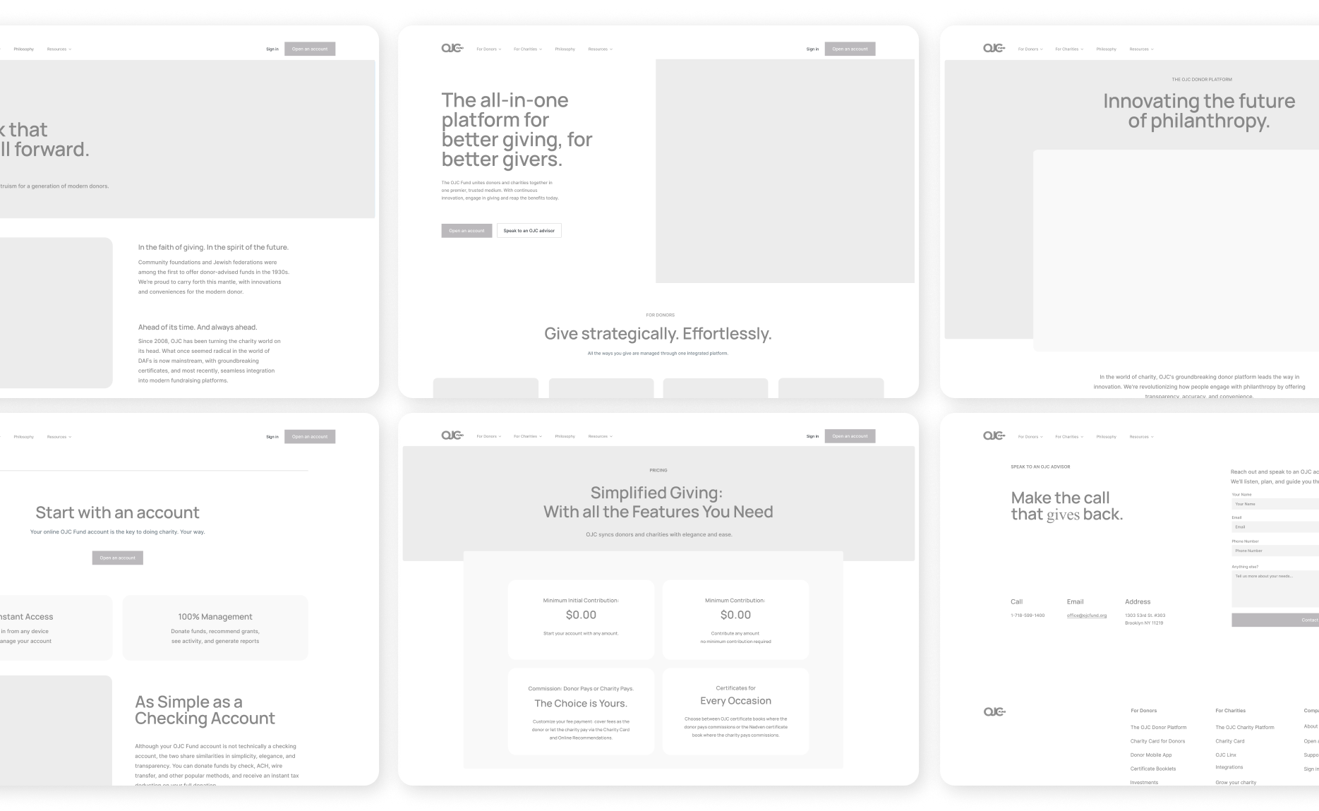
The low-fidelity wireframes helped establish the foundational structure of the new OJC Fund experience by clarifying page hierarchy, simplifying navigation, and defining the core donor journey. I explored multiple layout variations to surface essential actions earlier, reduce cognitive load, and create predictable entry points for donors, organizations, and advisors. These early wireframes allowed rapid iteration on messaging, content grouping, and task flows before moving into visual design, ensuring that the final interface was built on a user-centered and well-tested structural foundation.
Style Guide
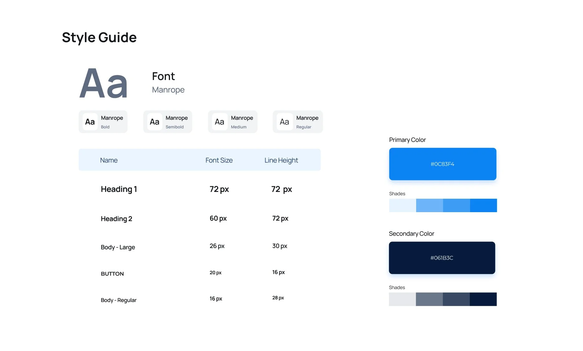
The style guide establishes a clean, modern visual system using the Manrope typeface and a refined blue-and-navy palette, enhancing brand trust, readability, and overall consistency across the experience.
High-fidelity Wireframes
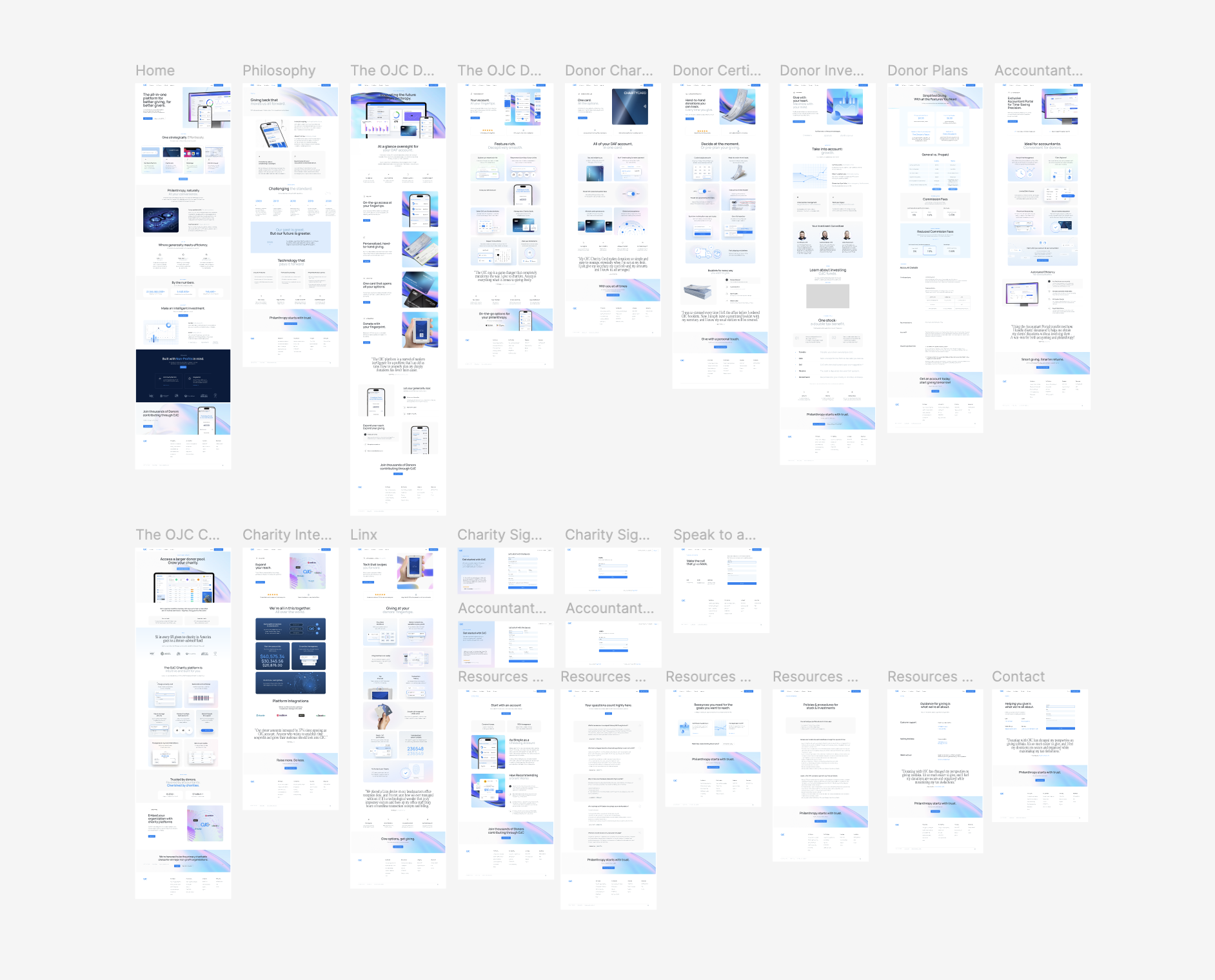
The high-fidelity wireframes translate the improved architecture into polished layouts, defining visual hierarchy, spacing, and interactions. This stage ensured consistency across all flows and validated that the experience feels clear, modern, and trustworthy before moving into final UI design.
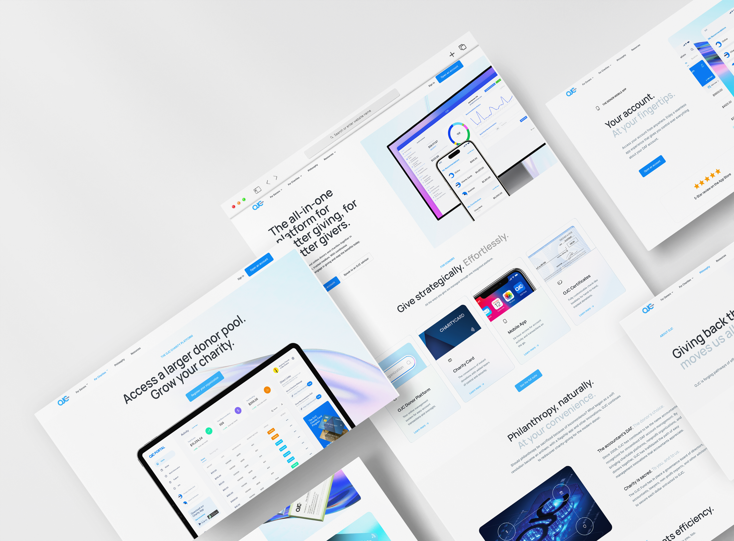
Result
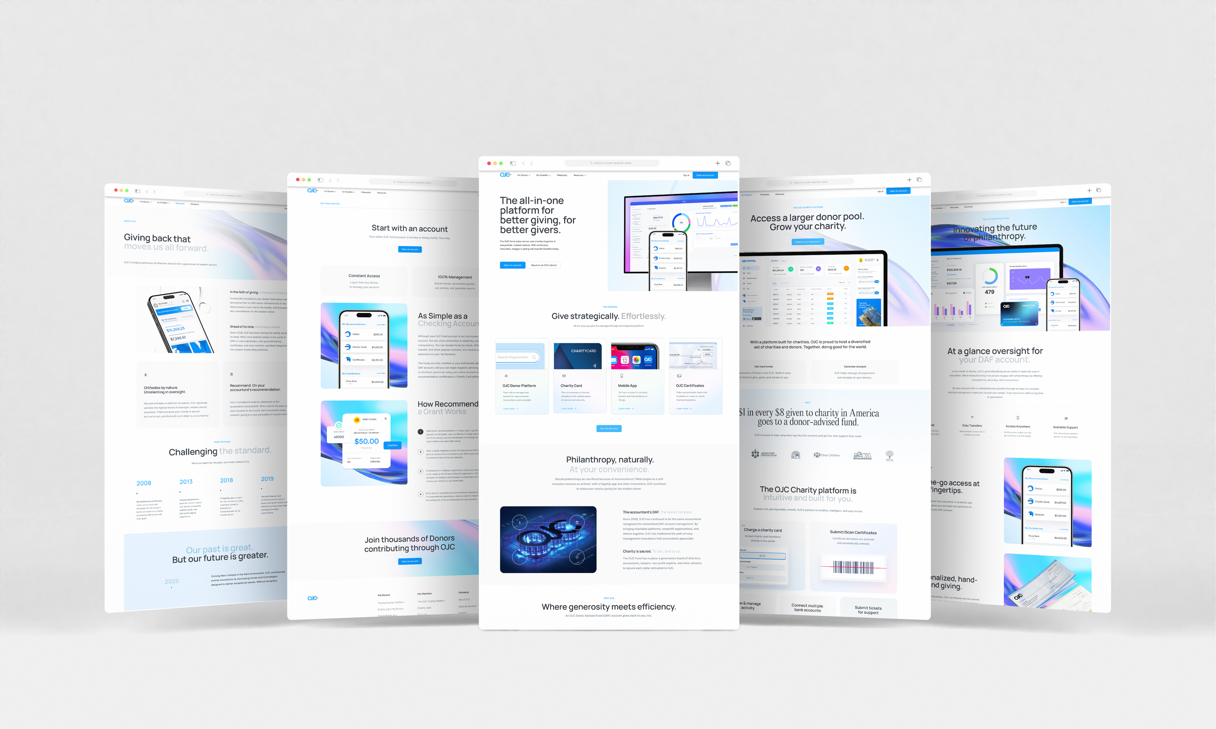
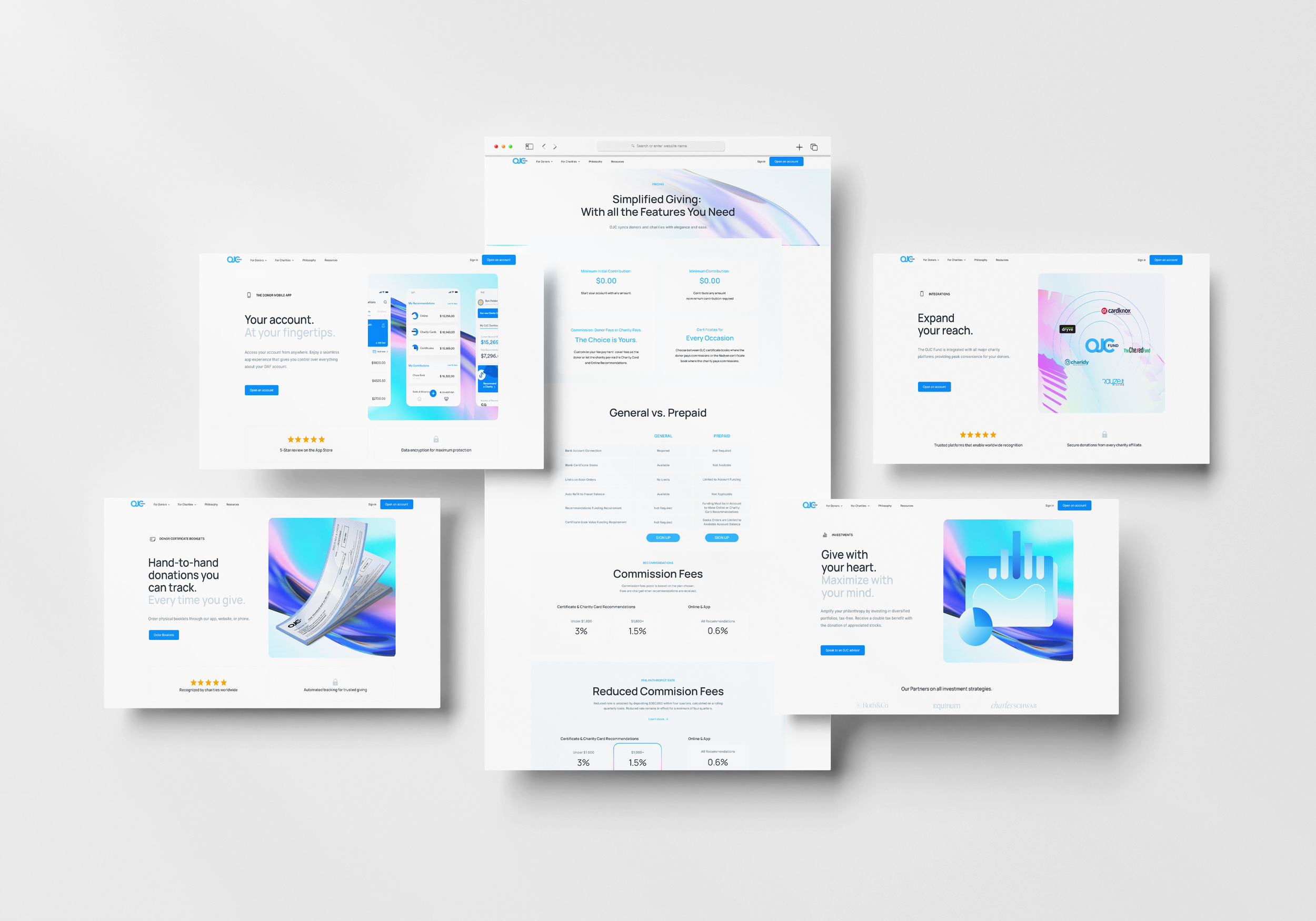
The redesign transformed OJC Fund’s digital experience into a clear, trustworthy, and intuitive platform. By restructuring the navigation, simplifying decision points, and introducing a consistent visual system, users can now understand the fund’s value faster, move through key tasks with ease, and feel confident engaging with the platform. The final design strengthens credibility, reduces cognitive load, and creates a seamless journey for both donors and charities.