
Virtus
Virtus is a personal safety and on-demand bodyguard app designed to help users feel protected as they navigate New York City. The final product brings real-time alerts, self-defense education, and professional bodyguard services into a single, streamlined experience. User testing showed that participants felt more informed, more confident, and more prepared during late-night commutes after using the app’s core features. Inspired by the Roman symbol of virtue and courage, Virtus was shaped through user research and crime-trend analysis.
As the sole designer, I led the project end-to-end, defining the brand identity, developing user personas, designing the logo, creating user flows and wireframes, and delivering the full UI. Through this project, I learned how to design for emotionally sensitive, high-stakes scenarios where clarity, trust, and intuitive structure are essential to helping users feel supported and in control.
Tools
Figma, XD, Illustrator, Photoshop
My Role
UX Designer
Deliverables
Mobile App
Time Frame
2025

Visual Identity
The Virtus logo combines crown-like geometric forms with abstracted map tiles, symbolizing protection, navigation, and strength. The vertical line texture represents continuous monitoring and real-time awareness, reinforcing the app’s mission to help users move confidently through the city.
Problem
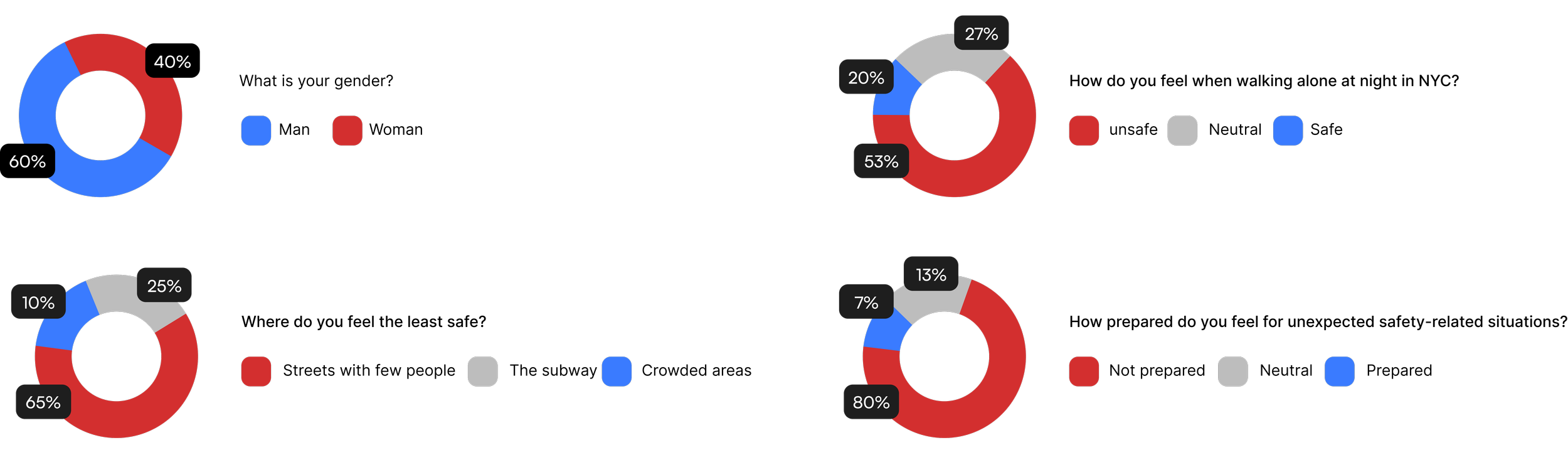
Crime in New York City has increased in recent years, creating a growing sense of insecurity among residents. In a survey of 15 New Yorkers aged 18–35, over half (53%) said they feel unsafe walking alone at night. Most participants pointed to empty streets and the subway as the places where they feel the least safe. Additionally, 80% reported feeling unprepared to handle unexpected or dangerous situations.
Key Findings
Gender: 60% identified as men and 40% as women
Night Safety: 53% feel unsafe walking alone at night, 27% feel neutral, and 20% feel safe
Least Safe Locations: Respondents selected empty streets most often (65%), followed by the subway (25%) and crowded areas (10%)
Preparedness: 80% feel not prepared for unexpected safety-related situations, 13% feel neutral, and only 7% feel prepared
Persona

I created this persona based on qualitative and quantitative research to better understand the emotions, pain points, and behaviors of users who feel unsafe during daily commutes. This persona served as a reference point throughout the design process, helping prioritize features that provide reassurance, awareness, and protection in moments of vulnerability.
Information Architecture
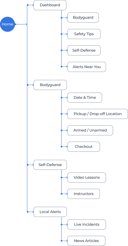
Because Virtus addresses real-world safety concerns, the information architecture prioritizes clarity, speed, and emotional reassurance. I organized the app into distinct sections that reflect how users naturally seek help: awareness (local alerts), protection (bodyguard), learning (self-defense), and daily guidance (dashboard).
This structure ensures that users can navigate confidently in any context—whether they’re scanning alerts before leaving home, booking a bodyguard for a late-night commute, or learning self-defense techniques. The result is a streamlined system that keeps critical information close and reduces friction throughout the experience.
Low-fidelity Wireframes
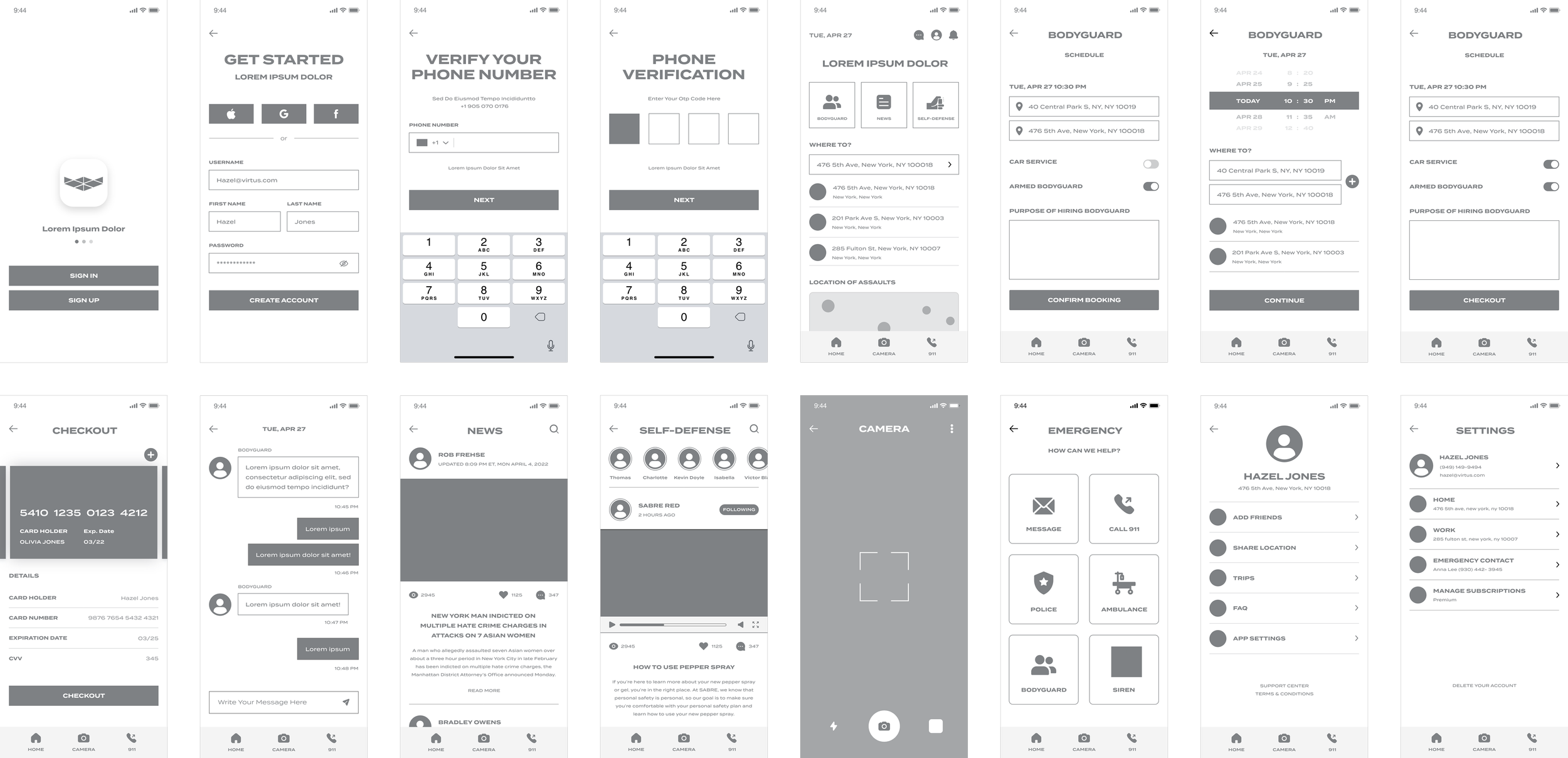
These low-fidelity wireframes were created to establish the structural foundation of the Virtus app before moving into visual design. They outline the core user flows: account creation, phone verification, the dashboard, bodyguard booking, self-defense lessons, alerts, messaging, emergency actions, and profile management. By focusing on layout, hierarchy, and task paths rather than visual styling, the wireframes allowed me to validate functionality, streamline navigation, and ensure that every feature directly supported user needs identified during research. This stage helped clarify how users move through the app in moments that require clarity and speed, setting the groundwork for an intuitive and reliable safety experience.
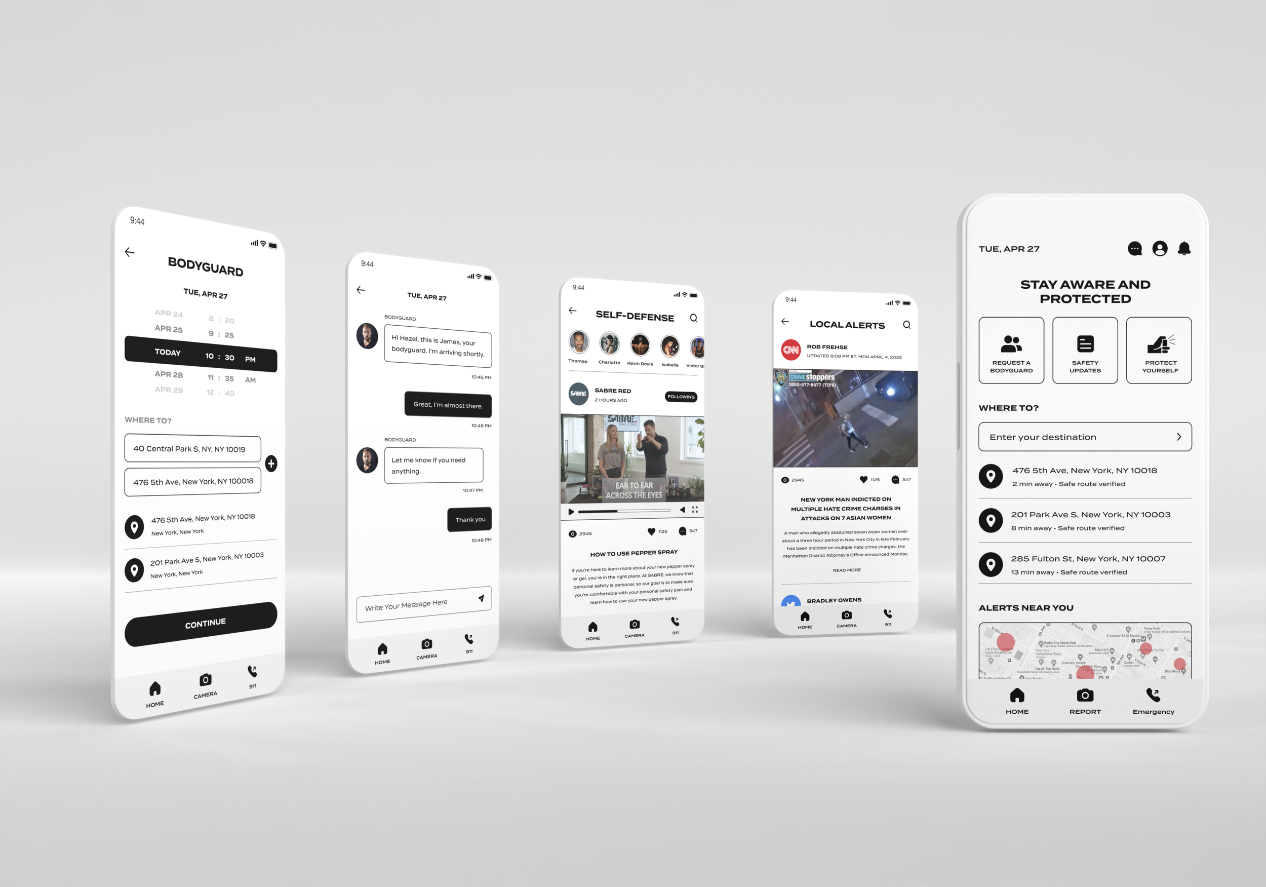
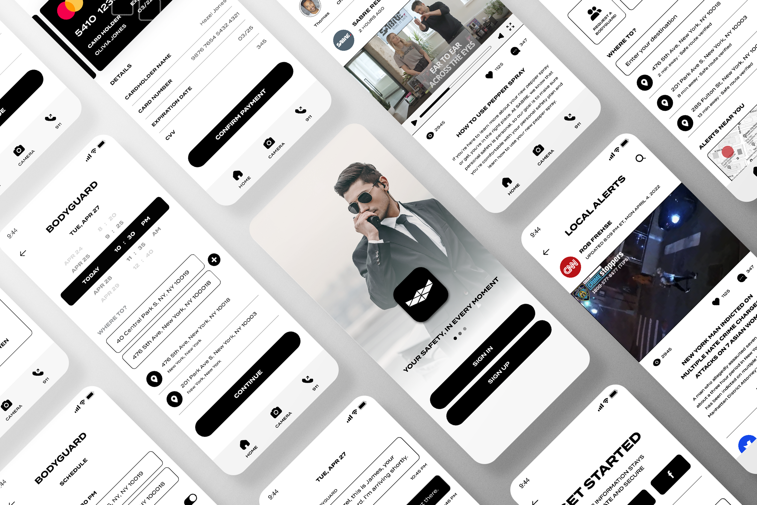
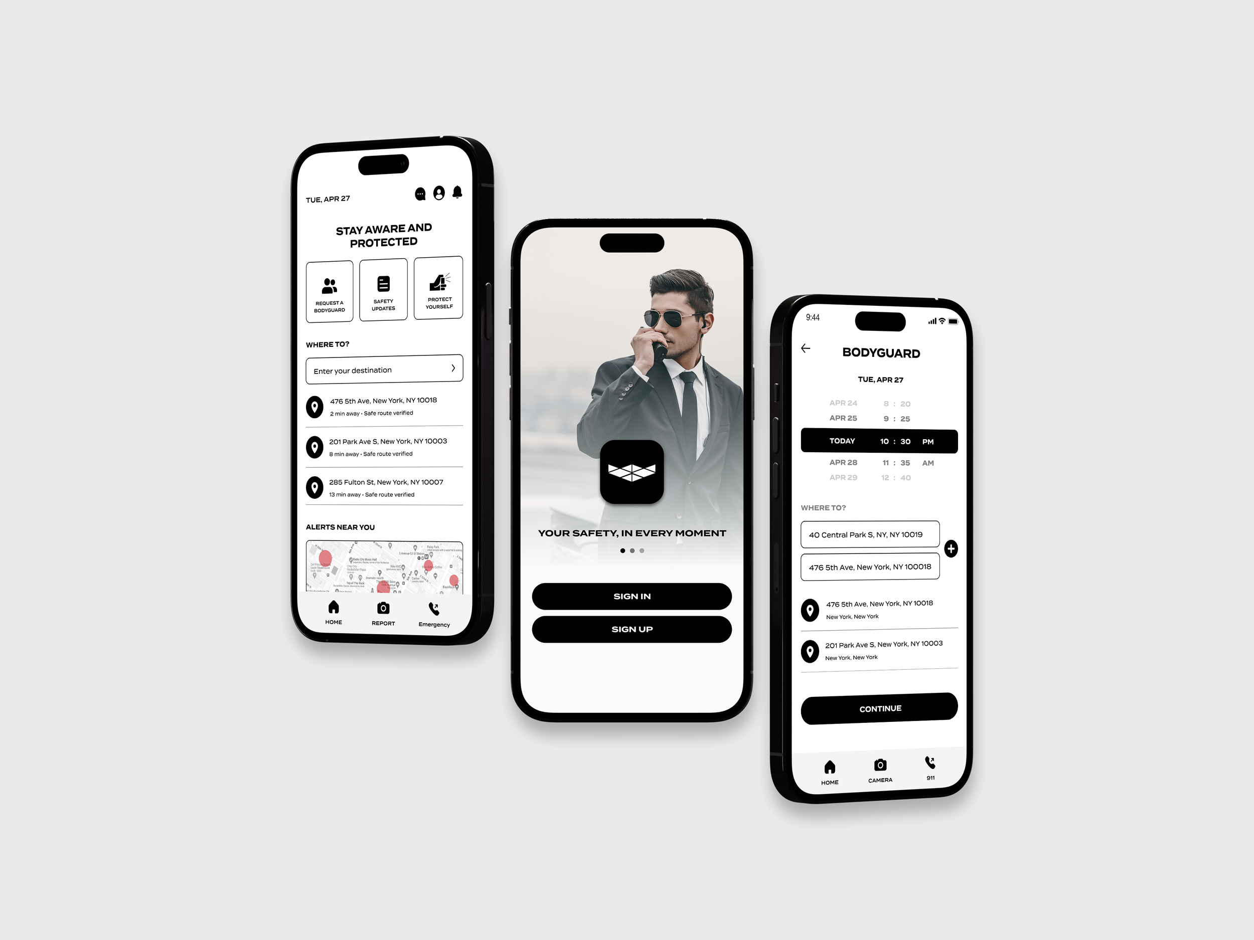
High-fidelity Wireframes
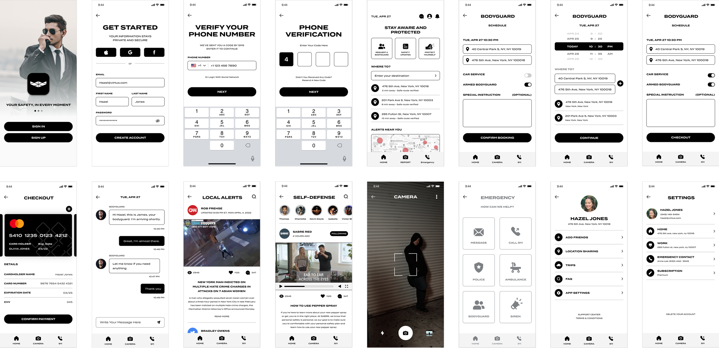
These high-fidelity wireframes represent the finalized structure and visual direction of the Virtus app. The refined layouts establish a cohesive visual system with consistent components, clear typography, and an intuitive navigation pattern designed to support users in moments where clarity and speed are essential. These wireframes served as the foundation for the final UI design, ensuring that each screen aligns with user needs while maintaining a clean, modern, and trustworthy aesthetic.
What I Learned
Designing Virtus taught me the importance of staying grounded in real user needs, especially when designing for sensitive, high-stakes situations like personal safety. Through research, surveys, and persona development, I learned how critical it is to understand users’ emotions, not just their behaviors. Moments of fear, uncertainty, and vulnerability must be supported with clear, simple, and reliable design.
Leading this project end-to-end strengthened my ability to translate complex safety workflows such as emergency actions and bodyguard booking into intuitive, accessible interactions. I also refined my process for structuring large feature sets into a clean information architecture that supports quick decision-making. Overall, this project reinforced how thoughtful design can create meaningful impact, especially when addressing real-world problems.